
Designing for opt-in: 5 principles we follow at ClearStake


“Usability is about people and how they understand and use things, not about technology”
Steve Krug, ‘Don’t Make Me Think’
At ClearStake, we are unapologetic design and usability nerds. We understand that a product can only ever be as good as it is easy to use. So whilst the technology behind our affordability platform is as advanced as it gets, we need to make sure that it actually works, in the hands of a human being.
In fact, in the space we are in this is doubly important. Operators using ClearStake are asking their own customers to share personal financial data in order to ensure those customers are protected, and that operators meet their regulatory requirements. There’s no point pretending otherwise: that’s a big ask. Big enough for some to feel it is never going to happen.
We know that it will happen, because we’ve already demonstrated that in live environments consumers are willing to engage with a process like this (over 50% of them at the last count). But to make that happen, they must have confidence in the process, it must feel ‘right’, and it must be easy.
Those are attributes associated with great interaction design and user experience. And that is why we invest so much time and effort into getting this right: because buy-in from the consumer is absolutely essential if affordability checks are going to work. After all, the situation today - in which over 50% of customers churn when asked to demonstrate affordability, and millions of pounds in revenues are lost - is surely not sustainable.
Here’s five principles we follow, which in turn deliver the best possible opt-in rates and a successful affordability process for all.
1. Offer choice - but guide where necessary
Most people don’t like being told what to do, instead they want help to do things the way that suits them. We’ve built this approach into the heart of ClearStake, ensuring that wherever possible we allow the user to share data on their own terms and in a way that gives them confidence.
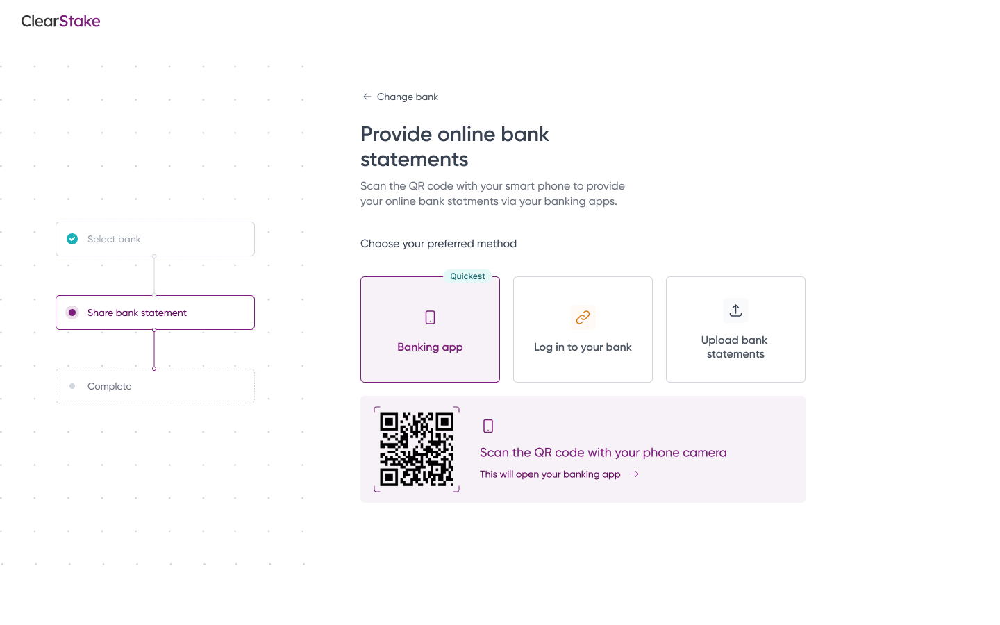
That’s why we don’t enforce sharing via Open Banking, but also enable users to share conventional bank statements in the same way that they have done until now. Not only is this reassuring, but in purely practical terms it helps maximise the opt-in rate for affordability checks. Ultimately we are agnostic about how financial data is shared - as long as it is.
That doesn’t mean, however, that we do not clearly identify the easiest, fastest and most secure way to share data, which is connection via Open Banking. The user deserves to know which method is best for them, and then make a decision in the light of that knowledge. Our approach here is subtle. We don’t want to railroad the user, simply make them understand which is the standard, default option.
2. Limit unnecessary steps
Central in our design philosophy is a laser-like focus on the goal, which in this case is the sharing of financial data in order to facilitate affordability and source-of-funds decisions. With that in mind, we are always careful to strip away anything and everything that can get in the way of that objective.
For the consumer in particular, that means a process that is super fast and super easy. It can be completed in less than a minute. We like to remind ourselves that our purpose is to remove the time-consuming and irritating aspects of customer due diligence, not add to them. On this basis, we are continually asking ourselves the “can we remove this?” question, and its good friend “is it really necessary to add this?”
The ClearStake customer flow has gone through many iterations. Every single one has involved removing steps rather than adding them. We intend to keep it that way.
3. Show feedback
Nobody likes to be left in the dark - or not know what they are getting into. That’s why feedback is essential in good user interface design. And as with so much else when it comes to user experience, that’s doubly important here.
For many customers of gambling companies in particular, affordability checks might be something they’ve experienced the hard way before. That is why so many of those customers churn when entering the process again, and why it is vitally important that we show clearly how little is involved to complete the same process with ClearStake.
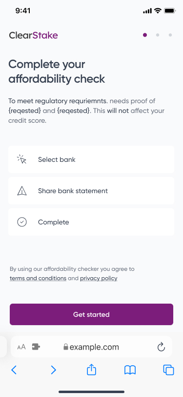
It is well established that when users understand how long a process will take, and get clear feedback relating to how far along that process they are, completion rates go up. We design to ensure that feedback is always present, users understand what is happening and why, and as a result as many as possible complete the process rather than step away.
4. Design for ease of use
It sounds obvious, and maybe it IS obvious, but it is worth saying it explicitly. We are fanatical about making things as easy as possible in every way. When designing, we interrogate every design decision, test with real users, and validate in the real world to ensure that the screens and interactions we create are idiot proof.
Consider the process of connecting a bank. We ensure that ClearStake users can either search or browse, and that if they choose the former we’ll automatically surface the best matches as they type. Connection itself has been designed to be incredibly straightforward. On desktop we surface a QR code after a bank has been selected. Scanning this with the phone essentially does the whole job: all that is left is to confirm precisely which organisations data is being shared with (feedback again). That’s it.
It’s also the smaller things. As noted above, we believe that Open Banking is the easiest and safest way to share financial data. That’s why we prompt the user to choose this option. But we also ensure that on the phone screen layout the Open Banking choice naturally falls under the thumb: so that the common, straightforward option is incredibly easy to select.
5. Prioritise what matters
We spend a lot of time (a year and counting) talking to operators about exactly what they need to see in an affordability platform. And in one meeting six months ago we got feedback that we really took to heart, which went something like this:
“It’s great to have the detail you show, but my team really needs to see the key information at a glance”
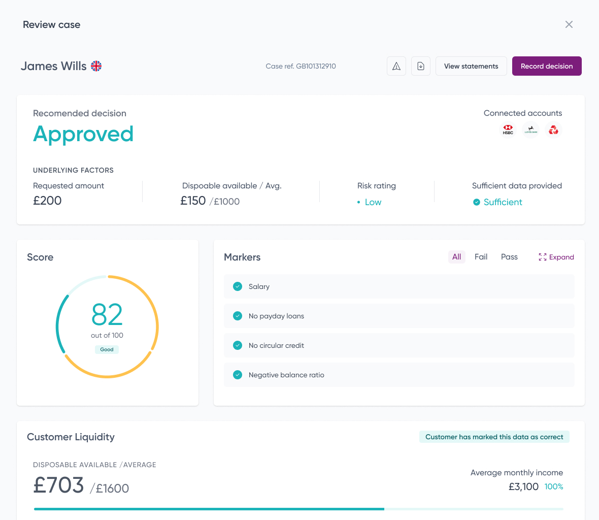
We went away and thought about how we show affordability information to those working with our reports within operators. And we made a number of changes in order to prioritise what matters. This has now become central to our design philosophy. We love detail, but we have to surface the main event. With that in mind, our report now leads with the things a compliance officer really needs to know: can we pass this individual for the relevant workflow, is the data we have a true financial picture, and are there any red flags on this account?
That isn’t to say we don’t believe the rest of the report is important. Far from it. We just work to ensure it supports both rapid, accurate decision-making in addition to deeper analysis where required. It's one more design decision in many, each made to ensure that as many customers as possible opt-in to checks, and the decisions arising from those checks are as easy as possible to make.